Showing posts with label Special Occassion. Show all posts

Thursday, September 7, 2017

Happy Birthday Jon!

Hello Ai fans!

This week the Art Impressions Design team is doing a product swap with Marvy!  We got the chance to try out several great products.  I'm showing you many of them today.  I'm sure you'll see a few other's on my blog here and there.  Like the Snow Writer. I didn't use it today, but I'll be using it for some future Christmas projects.  

Today's project is a birthday card for my brother Jon.  Every birthday he seems to end up wearing a crazy hat.  I used the Lifetime Set (SKU# 4728). I knew this was the perfect image for his card!


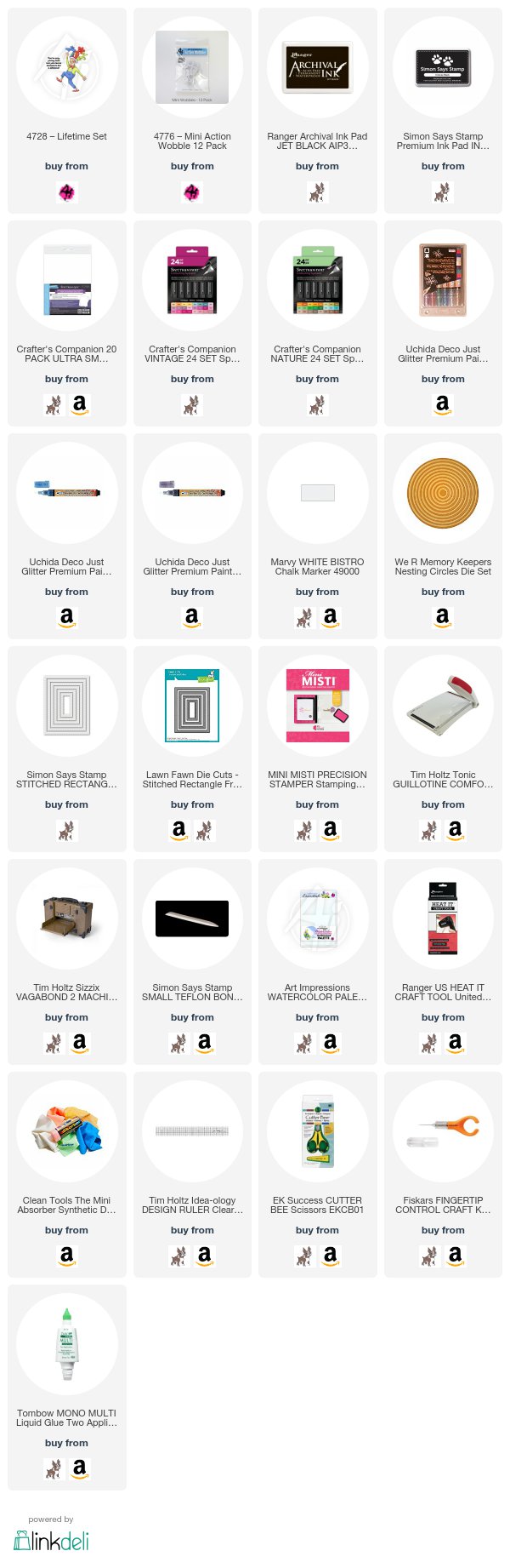
Over the years I have used many great Marvy products, so I was happy to be able to try out more Marvy products.  We received an assortment offlesh tone Le Plume Permanent Alcohol markers from Marvy.  I used OR820, Or821, OR823 and R813 on my old guys face, hands and legs. The rest of my image was colored with my Spectrum Noir Alcohol Markers.  I highlighted the balloon hat with the white Bistro Chalk Marker.  It has a nice Fine tip.  I also used it on the bow tie to go over some of the dots that had been colored over with red. Lastly I used the Deco Just Glitter Premium Markers for edging. I edged my card with the blue marker and the black layer with the purple marker. I was just careful to go slow while using the glitter markers for edging.  

Here is a closer view of my image.  I wish you could tell from this photo, but it's on a Mini Action Wobble spring. When you touch the image it springs to life.

As I mentioned above, the face is colored with the Marvy Le Plume Alcohol markers, I used the Spectrum Noir Alcohol Markers for the rest of the image.
Hair - RB2
Green - AG2, AG4
Yellow - CT2, CT4
Reds - DR4, DR7


Here are a few photo's of my brother.  The Iron Crab is my all time favorite!


Thanks for stopping by and Have a Great Day!

Compensated Affiliated Links Used
Thursday, August 10, 2017

Curious Cat Shaker Card by Jil Lebel


Hello Ai Fans!!

I am really honored to be joining the Art Impressions design team!  This is my first post & I really hope you'll keep coming back each week to see what I have to share with you. 


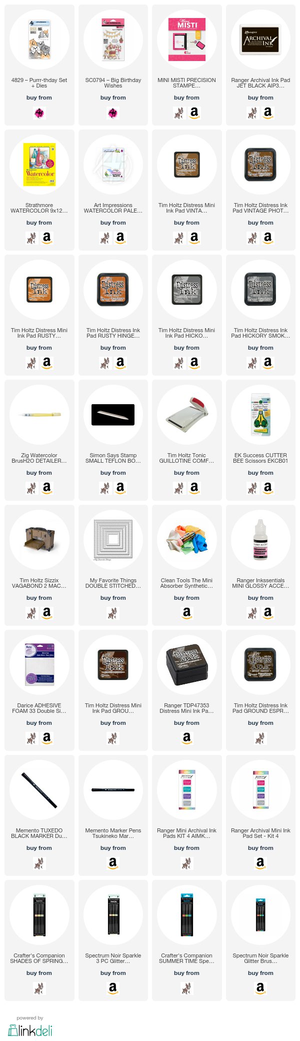
I used my Distress Inks to watercolor the Purrr-thday Set (SKU #4568) or with Dies(SKU#4829). It's a back & front set. I decided to attach the back sides of the cats to the front. 

Here is a closer look at the cats themselves.


  I wanted them to be looking inside the window at a cupcake . The cupcake is from the Big Birthday Wishes Set (SKU # SC0794) that used to be only available at Michael's stores.  You can now get it from the Ai website!


When the card is open you can see all of their curious little faces.


Just in case you were wondering, this card is cat approved! 


All of my supplies I used are listed below. Compensated affiliate links are used


Wednesday, August 9, 2017

Showered With Love Ai Challenge Card

12:00 AM

The Art Impressions Blog  is hosting a new challenge, Showered With Love. Show us the shower cards you can create! We would love to see baby or bridal shower cards. Joining our challenge is easy, plus, you just might win Art Impressions stamps!

Image may contain: text

I decided to make a card with a bridal shower theme. 


`````

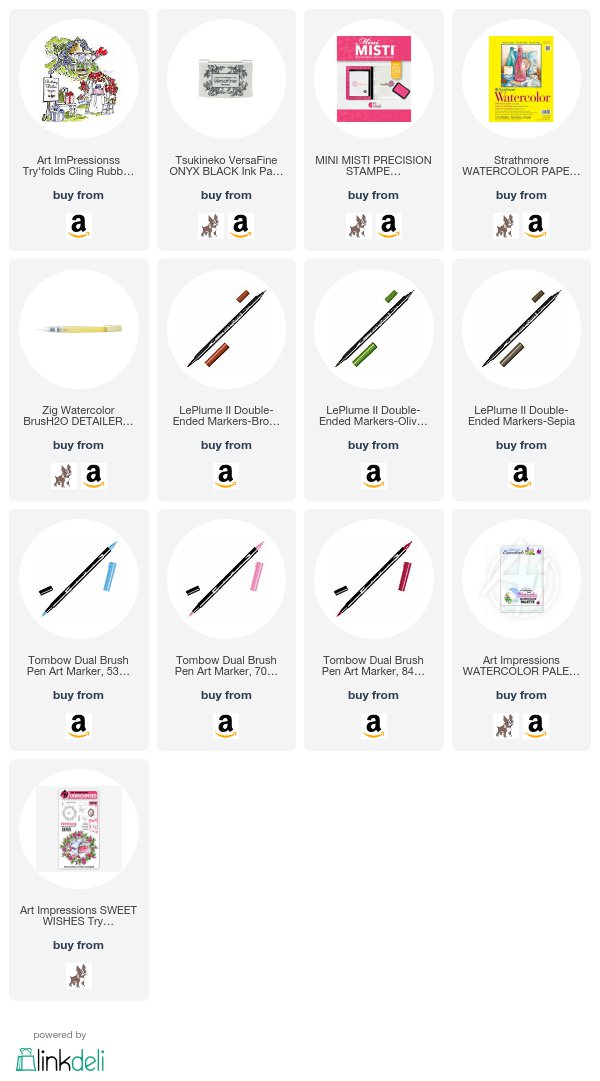
I used the Gazebo Try Fold (SKU #4338) stamps.The try fold sets are usually used on three separate panels but I wanted to make a flat card today.  I just stamped all four stamps onto my watercolor paper & colored them with a mix of my Tombow dual brush markers & my Marvy LePlume markers & a water brush.  Here is a very similar birthday card that I made with the unaltered stamp set .


 You can see how the stamp set is actually a birthday set.  I just masked the balloons off of the gazebo.  I replaced the candles with a second layer of cake after some more masking.  I also masked the sign in the front left hand side because it had a birthday message.  I added in the rose from the Sweet Wishes Mini Try Fold set ( SKU # 4848).  It took a little extra time, but it gave me two uses from one stamp set.  This is what both cards look like.


Thanks for stopping by & have a great day!


All of my supplies I used are listed below. Compensated affiliate links are used. 


Tuesday, March 28, 2017

Distress Oxide Painting & Background Featuring Lawn Fawn Hoppy Easter


I am in love with my Distress Oxide ink pads.  I just couldn't wait to get another chance to paint with them again.  I figured that it would be fun to do a cut image with them this time.  I also wanted to start some of my Easter cards.  I decided that it might be fun to make these bunnies look plastic like Easter eggs so I picked a few bright colors to paint them with.  I stamped them & their accessories onto my Strathmore 140 lb. watercolor paper using my Jet Black Archival ink.  I just painted with the Oxide ink using my #4 paint brush.  I added the shine marks towards the end after everything was dry.  I cut the images out, but you could use the matching die cuts.  The middle image is attached with a mini action wobble spring.  Right after I attached it in the video my cat saw it & started playing with it.  It's priceless!


The background is done onto a #8 manilla tag. I used the smooshing technique and three Distress Oxide inks.  I used Worn Lipstick, Cracked Pistachio & Broken China.  The bunnies are painted with Wilted Violet, Broken Chine & Cracked Pistachio. The smooshing technique is rather simple.  You smoosh your ink pad onto your Ranger craft sheet & spray it with water, then take a piece of plastic & tap it into the ink & tap it onto your paper.  That is what created the drops on my background.  I find it gives me way more control & smaller dots.  You can see the entire technique in the video below.  Be sure to watch to the end to see Ceasar playing with the action wobble bunny.  It's really cute! Thanks for stopping by!  Jil
All supplies are listed after the video.  Compensated affiliated links are used. 


Monday, March 27, 2017

Stampendous Build A Bouquet Pop-Up Watercolor Card

4:44 AM

I used two stamp sets from Stampendous to make a water colored pop-up birthday card.  This is the front of the card using the clear stamp set from Michael's that came with a matching die cut set.  The images are colored using the Peerless watercolor sheets.  The background papers are from a paper pad that I picked up from Michael's some time ago.  I show how I colored it in my video.  My Tim Holtz Script Celebration Words Die Cuts came in handy for the greeting.


The pop up section is made with the retired Sizzix pop n' cuts dies that they did with Karen Burniston.  I used the Bigz XL A2 card base tray with the 3-D label insert for the pop-up part.  I cut that out of black paper.  I also cut a horizontal A2 card out of  black paper to fit it into.  I stuck the pop-up portion into the card with a generous amount of adhesive.  Just be sure not to add any adhesive behind the pop-up area.  I added layers once I know the pop-up is working correct.  The flowers were also colored with the Peerless watercolor sheets.  I went over the flowers with my Spectrum Noir Clear Sparkle Pen.  Just remember that it is water based & will move around the watercolor. The video showing me making this card is below. Thanks for stopping by!  Jil
I've listed all of the supplies I've used below.  
Compensated affiliate links are used at no cost to you.  


Thursday, March 23, 2017

More Spring Flowers colored with Spectrum Noir Sparkle Pens


I've had my Spectrum Noir glitter pens for quite some time now, but I haven't done too much with them.  I've used the crystal clear pen over tons of things but the colored pens are gathering dust.  I dusted them off & used a bunch of them for this project.  I just got the Simon Says Stamp More Spring Flowers stamp sets that was designed by Kristina Werner and could hardly wait to use it.  I have a soft spot for flowers.  I stamped out three flower clusters onto two different types of watercolor paper.  The card above is on Canson XL.  It's a 90 lb watercolor paper.  It was actually my favorite because the color sat on top of the paper longer without sinking in.  


This image is also the Canson XL (it has the Sparkling Clear Sequins.) I stamped the images out several times using masks.  I filmed it for my video, but the footage got corrupted.  Because I wanted the rose in the front, I stamped it first.  Then I stamped the Daisy & Blue flowers ( I think they're Crocus), lastly I stamped the leaves because I wanted them all the way in the back.  I sid all of my stamping with Vesamark Watermark ink.  I coated each step with Ranger White Super Fine Detail Embossing Powder & heat set it each time before moving on to each layer.  The glitter looks like white specks in each picture.  I can't get that to go away.


This is the card I filmed for the video.  It is on Strathmore Watercolor paper.  It is a 140 lb paper.  I love how thick it is.  It just has a rougher texture that was harder to work with because it drew in a lot of the color.  It just means that I preferred it for this medium.  I prefer my Strathmore for many other things.  That's why I tried it with both papers.  I really like how both cards turned out.  Did you prefer one over the other?  Just let me know in the comments below. The video of me making this card is belowThanks for stopping by!


 I've listed out all of the supplies below. Just click on them.  Compensated affiliate links are used at no cost to you. 


Monday, March 13, 2017

Lawn Fawn Hang In There Birthday Card


When I saw this sloth image as part of the Lawn Fawn new release I knew I had to have it.  It is just so silly looking.  I colored the image using my Zig Clean Color Rel Brush Markers after I had stamped it onto Bristol paper with my VersaFine Oxyx Black Ink Pad.  I used a water brush to blend out the colors on the party hat. I used just the markers to blend the sloth &  the log.


I cut another piece of Bristol paper with the double stitched oval STAX as well as a piece of acetate.  I blended two shades of distress ink onto the Bristol paper & splattered it with a mix of Perfect Pearls & water.  I made  frame from white paper using two mote of the STAX shapes.  I attached that frame to the acetate with glossy accents & added foam tape behind that.  I then added sequins in between the foam tape.  I put the Bristol piece of paper over the foam tape to sandwich in the sequins.  All of that was added onto a card that has a rectangle of the Lawn Fawn Plaid paper attached to it. Here is a video of the entire process.  All of the supplies & links are provided below the video.  Compensated affiliate links are used at no cost to you.


Monday, February 27, 2017

Dahlia Blossoms Blue Altenew Class Card

4:16 PM

The first day of class homework for Altenew Academy ( you can find it at altenewcademy.com) was to use the color blue. The mood we should be inspire to feel is calm & tranquility. Blue is my favorite color, so this was an easy color palette for me.  I work with blue often.  I also love the Dahlia Blossoms stamp set from Altenew & haven't had a chance to use it since I bought it some time last year.  I got my stamps & my Gansai Tambi paints & spent some quiet time painting.


 I really water down my Gansai Tambi paints for the first layer or two.  I'm sure you'll notice that in the video.  As usual, I've included a complete supply list for you at the end of this post.  If you have any questions, please let me know.  Thanks for stopping by!  Jil


Compensated affiliate links used at no cost to you.


Thursday, February 9, 2017

Hummingbird Card using Peerless Watercolors

11:33 PM


I think we can all agree that I love watercolors.  I just love the way they flow and move in an unexpected way.  I've been using some of my different types of watercolors & I used my Peerless watercolors for this video.  These are some of the most unusual because they are in a paper form. They special leaflets are a concentrated transparent watercolors and I just cut them to the size I need & add them to my hand made book.  My book is just some sheets of heavy watercolor paper with sheets of transparency in between the pages. 

This is a view of the book open.


I have the name in sharpie below each color as well as a sample of the color from dark to light.  To use each color, I just use the tip of my brush along the corner to pick up a little color.  There is no need to pick up color from the center, it just dilutes the color on the leaflet.  If you're careful with them, they last a really long time.


I embossed my images onto Canson XL embossing powder.  It makes it really easy to have specific areas to work inside of with the watercolor.  I work both wet on dry & wet on wet with my paints.  Both techniques work great here.  I'm just careful not to uses too much water with this paper.  These paints are very translucent & layer beautifully!
 I've supplied you with the links to all of the products at the bottom of my post. Compensated affiliate link used at no extra cost to you.

I filmed the entire process.  Here's the video.


Saturday, April 4, 2015

Baby Shower Invitation

5:08 PM
I haven't posted in a while, but not for the usual reasons.  I haven't lost interest.  I've been working on a large project that has taken all of my time.   I actually have been working on a few projects, but the large project is finished.  I've been making 30 invitations for a baby shower.  I decided to use an image of a bear in a moon & water color it.  It is so cute, but so time consuming.  I also foiled the sentiment on the front of the invitation.  I had to figure out how to best do that with my laminating machine.  I've also done a chipboard album & a guest book.  I'll post those when they are completed.  I have done a video on the invitation along with my Easter card that I'll show in a later blog post.

The invitations are really straightforward.  I guess you could call them clean & simple.  That is something I never do.  I'm just not good at it.  I didn't even add foam tape!  I simply used my Strathmore cold press 140 lb. watercolor paper & cut it out with the petite oval nestabilities.  I stamped the image onto the oval with my Versamark watermark ink pad & embossed it with my black Powder Keg embossing powder.  I was sure to first use an embossing buddy on the paper so I didn't have any stray embossing powder.  I then colored in the imaged with my Twinking H2O's.  When I use my H20's, I always spray them with water ahead of time so they form a creamy paint.  I like to apply them with a waterbrush.  I find that the stiff bristles on the brush give me more control than other brushes. From there it was just a matter of layering everything together.  The foiling is the only other unique thing that I did.  I got the idea of using my lamination machine to foil my greeting from Jennifer Maguire.  She shows you how to do it on you tube.  Just search it & it will come up.  I always love her ideas.  This picture is a bit washed out, but you get the idea. Just let me know if you have any questions.


SUPPLIES:

PAPERS: Mambi Baby Girl 12x12 paper stack, DCWV Metallic Textured Paper Pink, 140 Lb. Strathmore cold press watercolor paper

STAMPS:  Inkadinkado teddybear & saying

INKS & PAINTS: Brilliance Pearlescent Orchid ink pad, Versafine Onyx Black ink pad, Versamark Watermark ink pad, Twinkling H2O's baby's breath, chiffon pink, celestial sun, golden sand

ADHESIVES: Scotch Quick-Dry Adhesive,

MISCELLANEOUS: Powder Keg black embossing powder, heat tool, Minc light pink foil, laminating machine, deco crop-a-dile corner rounder, Claudine Hellmuth #4 round paint brush, fine tip water brush, Spellbinders Nestabilities small & large long rectangles, large petite ovals & large petite scalloped ovals